Update 2008-08-11: Read "Even more Web Analytics Dashboards Fun in Excel 2007!" and get an enhanced version of this spreadsheet!Defining KPIs and designing dashboards is challenging for most web analysts. Even if you are lucky enough to use such tools as Tableau or Crystal Xcelsius, you can still go a long way just with Excel 2007. Read on for some tips I've come up while creating dashboards for my clients.

A word on KPIs
I think it's fine to show base metrics on a dashboard, such as Visits and Visitors, Orders and Revenues, etc. People can easily understand what they are and those represent the lingua franca of web analytics. But I also want to show "composite" metrics such as:- Conversion rates and ecommerce: customers/visitors, orders/visits, items/orders, average order size, etc.
- Success rate: ratio of any success events by visits, such as orders, of course, but also subscribing to the newsletter, participating in a contest, etc.
- Engagement: I leave it to you to find your own formula, but thinking in terms of "persuasion architecture" we can identify waypoints, points of resolution and conversion events that are significant, assign weighting and values to those events and create a good indicator.
Current vs previous periods
 A raw number without context is useless. Just saying "we had 150,000 unique visitors this month" doesn't provide enough context. If I add "... vs. 120,000 last month" it's already better. I'm always reporting the current month vs the last, and the current month vs the same month of last year. If you look only at the peaks and lows over months, you won't see the annual cycle that is characteristic of most sites.
% Change & indicators
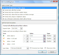
The next thing to add to our dashboard is an indication of the magnitude of change. Did we significantly increase visitors or it's just a small tip? Then we want to add an indicator, such as an up or down arrow which will make it easier to spot metrics that might be correlated.- Formula: % Change = (this period metric/previous period metric)-1
- Format: from Conditional Formatting, choose Icon Sets, 4 Arrows (Colored).

- Rules: over 5% improvement is green, below 5% degradation is red, etc.
 Using an indicator along with the color will help those who are colorblind (1% of the population).


Sparklines
There are many ways to create "sparklines" and even some Excel addons like Bissantz SparkMaker or BonaVistaSystems MicroCharts. I think Excel 2007 does a pretty good job "out of the box":- Create a line graph that includes 13 months of data (remember we want to see "this month" vs "same month of last year")
- Clean up everything (title, axis, legend, lines, etc.)
- Put this new chart in a slightly enlarged cell and voilà! You have a spark line
- Click on the line
- From the Chart Tools, Layout menu, click on Error Bars and Error Bars with Standard Deviation
- Some cleanup again; right-click on the error bars area and do Format Error Bars
- Direction: Both, End Style: No Cap, Standard Deviation: 1.0
- Line Color: 80% transparency and Line Style just wide enough to overlap each other by one pixel (bug: Excel won't keep those changes if you change the main graph)
 In the example above, notice the trend over a 13 months period and two areas where the line goes outside the limits. If you look carefully, you will also notice small lines which are the months ends.
Control limits and significance
I already talked about box plots, significance and outliers. How do you know if your current metric is way out of bound? This is called an "outlier": the strict definition is "an observation that is numerically distant from the rest of the data". Since our data is usually pretty much a normal distribution, using the mean and standard deviation is ok:- Upper Control Limit = Previous 12 months Mean + Standard Deviation
- Lower Control Limit = Previous 12 months Mean - Standard Deviation

Dashboard sections
Each client is different, but I usually create a couple of sections grouping related metrics, such as "General Statistics", "eCommerce" and "Conversions". One section that I particularly like for ecommerce or content sites is "Movers & Shakers", which goes beyond the "top 10s" and show those items that changed the most over the previous month.When printed, each section of the dashboard must fit on a single page with enough room to take hand written notes.
Analysis
As an analyst, you should always add a couple of lines verbally explaining your analysis. You never know where the dashboard, either printed or electronically, will end up. Unless one metric is really significant, I prefer to put my comments at the bottom of a group of metrics and "make up a good story" about what happened. And please, don't just say "This months visitors are up"... this should already be obvious enough! "The increased traffic is representative of our annual sales cycle and confirm the significant (33%) improvement we've been seeing over last year."Segmentation, automation & customization
 I include a "control center" at the top of the Excel dashboard where you can pick the month and any other appropriate segmentation. This way, from a click of a button, you can easily switch back & forth between months or segments. All the data in the dashboard gets automatically updated.
Of course you don't want to spend days and weeks updating your dashboard. The data is fetched from other tabs and whenever possible the raw numbers are imported (for example, if you are using Google Analytics) or better still, hooked up through an API (for example, through Omniture SiteCatalyst Excel client). Some fairly sophisticated Excel formulas (not even macros) are used to automatically update everything.
From this master template, I can create dashboards much more easily and with a few quick changes, I can remove or add new metrics and KPIs.
Your take?
If you want to go further, I recommend the book "Information Dashboard Design: The Effective Visual Communication of Data" by Stephen Few and the Dashboard Spy blog is a pretty good source too.Do you have any dashboard tricks to share? Any sugestions on how to improve my dashboard? I would love to hear your feedback!